Innovation Alphabet
Data Visualization
In a nutshell
Data visualization literally means the representation of data through common graphs or animations to help managers and decision-makers identify otherwise invisible phenomena and trends. Data visualization is intuitive, inspiring and aesthetically pleasing. After all, it mimics the way the human brain processes information.

A major difference
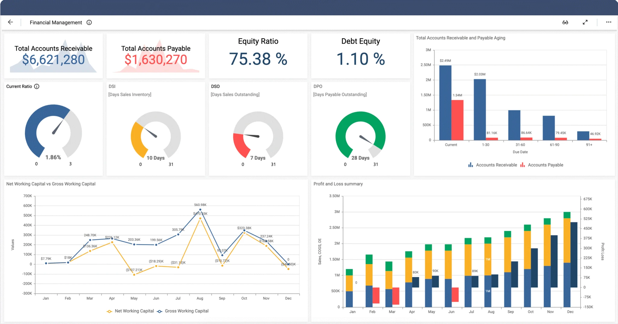
Data Visualization vs Business Intelligence
Data Visualization is the process aimed at making the patterns and insights of data understandable by transforming them into visual context. Information can assume different forms like pivot tables, line graphs, pie charts, and so on. This process mainly addresses clients and entities outside the company that collected the data.
Infographics, in particular, are a simpler and more straightforward type of Data Visualization. They use Information Design principles to convey complex concepts to a wider audience in an easily digestible format. The use of infographics is directed to external stakeholders.
On the contrary, business intelligence is a process that focuses on gathering, organizing, recognizing patterns in, and deriving meaning from, the information a company gathers. Therefore, it uses data to make relevant decisions, regulate growth-oriented strategies, and make future predictions.
Application Fields
• Decision-Making: Infographics are an aesthetically pleasing way to summarize data and share information in a more compelling, engaging way. Also, visuals speed up the rate at which information is processed. The faster clients process information, the faster they will make decisions.
• Brand Credibility: Creating interesting and easy-to-understand graphics can help people learn more about you or your business. You can become a voice of authority. An expert in your industry. A thought leader. And, finally, a trustworthy source.
• SEO: Data visualization formats can drive more traffic to your site, improve your ROI, and increase conversion rates. In order to boost your website’s visibility on search engines, you should add alt text, a title, and a description of the image. One great way to improve your SEO is by making sure your infographics are shareable. Indeed, if they’re shared often enough, people may link to them from their own pages, improving your chances of appearing at the top of the SERP.
Industries
• Data Visualization to represent history
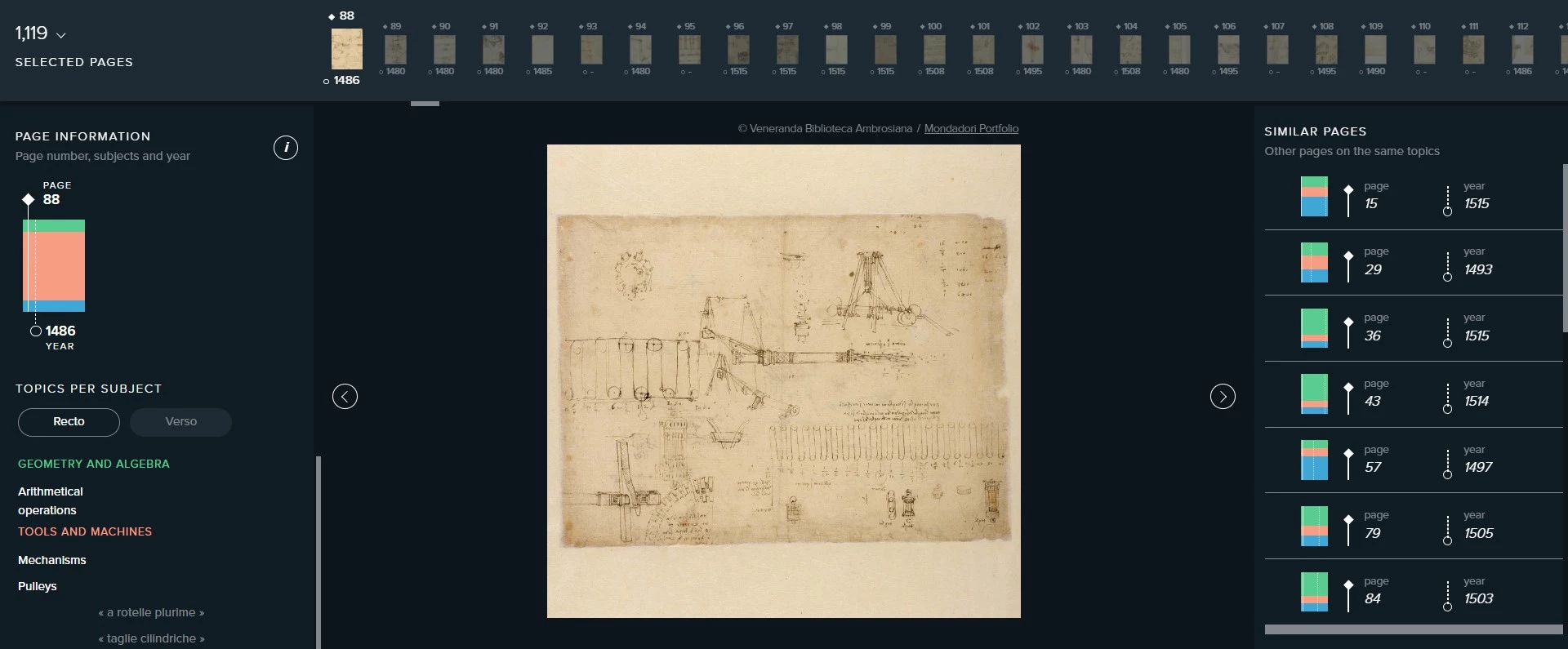
Codex Atlanticus is a project conceived by the Biblioteca Ambrosiana of Milan in collaboration with “The Visual Agency” with the aim of making the images and contents of Leonardo Da Vinci’s Codex Atlanticus accessible and understandable to everyone. Thanks to the Pinacoteca’s initiative, it is possible to browse through the pages of Leonardo’s Codex in digital form and understand the evolution of a genius’ interests at different stages of his life.
• Data Visualization on outer space
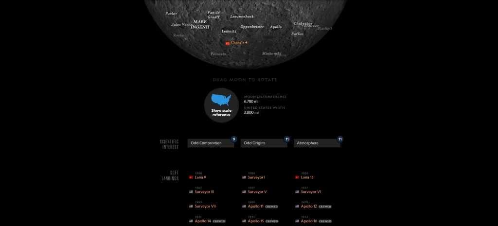
National Geographic has developed The Atlas of Moons, a graphical representation of data that allows people to travel through space. It represents a true animated and interactive guide to the natural satellites in our solar system, thanks to which Internet users can say they really feel like they are “on the moon”.
• Data visualization on climate change
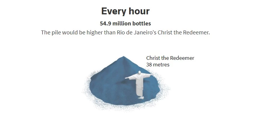
Drowning in Plastic is a graphic representation created by Reuters Graphics that compares volumetric measurements of the total amount of plastic bottles sold each hour, day, month, or year with those of famous monuments, buildings, or cityscapes. The goal is to help understand the world’s dependence on plastic bottles and trigger a tangible sense of the danger from the resulting pollution.


Do you have a Strategy & Innovation challenge to tackle? Let’s face it. Together.
C-levels from these companies (AND MORE) relied on my expertise to overcome thEIR CHALLENGES IN THIS AREA. And you can, too.
Can I help you?

Business Functions
• Data Visualization in support of customer experience
Boldare is a digital product design and development company which, in 2018, have worked with a German green energy company to digitalize their services and provide better user experience to their customers. Boldare created one of the core applications of that client’s portfolio – The Portal. It is an app dedicated to end customers using the company’s products, batteries and photovoltaic installations. An information hub that gathers all the data coming from the entire installation connected to the building and displays it with easy to understand visualizations.
• Data visualization in support of business development
The same Boldare made an interesting public platform for a government-owned business development company in the MENA region. The platform helps users to visualize data in order to make better decisions about their businesses. For example, it is very useful when a restaurant owner (or an owner to be) looks for the best place to open a new branch. Using a Google-based maps app, the owner can see the number of restaurants in a specific city district. Therefore, if the competition is too heavy, it will be easy to check adjacent neighborhoods in search for a better location.
Stay in wonderland
Let me show you how deep the rabbit hole goes.
Check out more of the Innovation Alphabet:
3D Printing
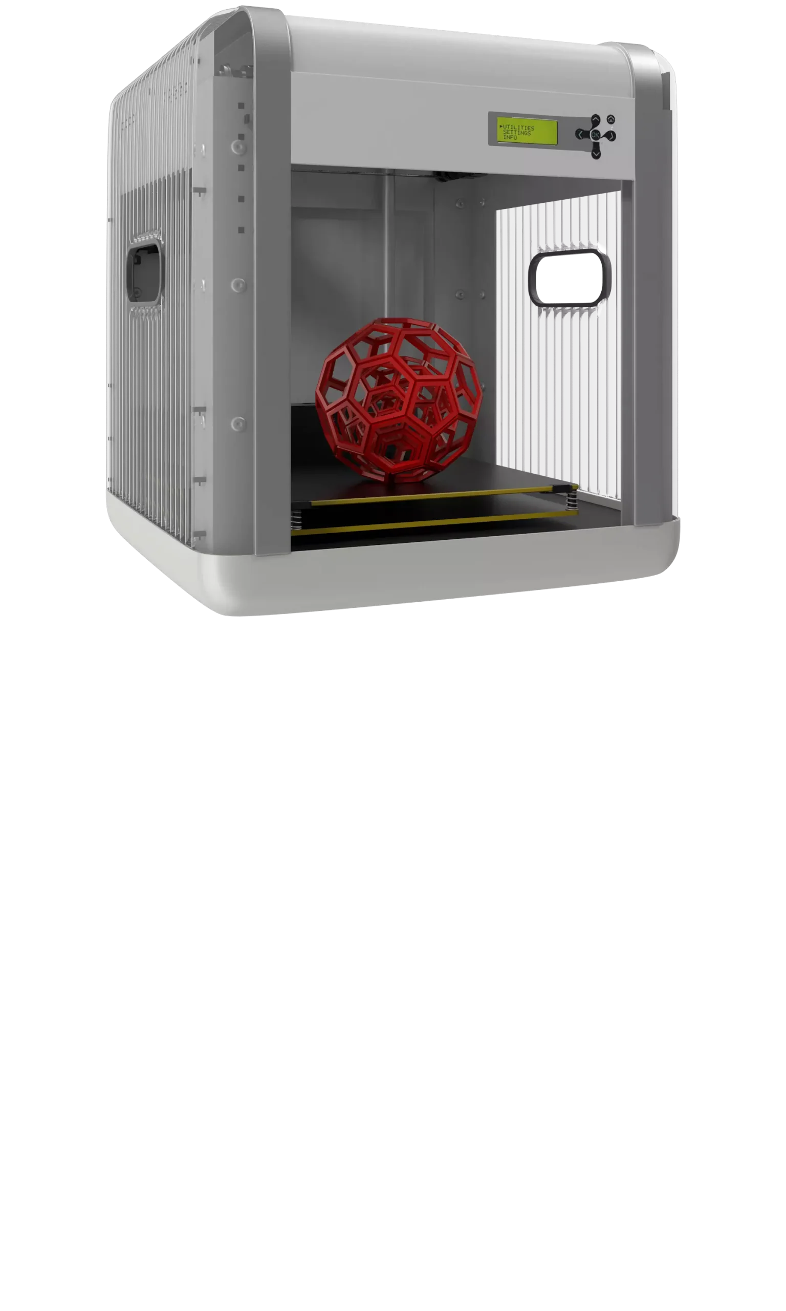
3D Printing
“3D printing” is a process carried out by an electronic device which, instead of resorting to the canonical ink, it molds almost any kind of material: from concrete to living tissue, most usually plastic, but also metal. And the operating principle is similar to that of a traditional printer. The creation of three-dimensional models can lead to the redesign of a company’s production capabilities.
Dive In
5G
5G
5G is the new frontier of cellular telephony. It was designed to improve (or completely replace) previous generations of mobile networks. The 5th generation features lower latency, ensuring flawless performance of business applications and many other digital experiences – thus enabling the new cultural generations to furiously play Fortnite away from home.
Dive In
Advanced Analytics
Advanced Analytics
The term “Advanced Analytics” refers to the ability to autonomously or semi-autonomously analyze data and content to identify correlations, develop analyses, predictions, and recommendations. It is not just a matter of collecting information and then organizing it into watertight compartments: the ultimate goal is to identify a dialogue pattern from a data-driven perspective.
Dive In
Agile
Agile
Agile is an approach to software development designed to respond to change. Teams quickly analyze the context in which they operate, identify uncertainties faced, and figure out how to adapt to always move forward. Interaction between individuals comes before processes and tools; collaboration with the customer is more important than negotiating contracts.
Dive In
Ansoff Matrix
Ansoff Matrix
The Ansoff Matrix is a marketing planning model that arises from the intersection of new and existing products and markets. It derives four possible strategies for expanding the company’s market, which are built around four variables with a changeable factor of risks and possibilities: existing product, new product, existing market, new market.
Dive In
Artificial Intelligence
Artificial Intelligence
Artificial Intelligence is not strictly defined. Basically, it is a computer system able to make decisions in an independent and flexible way. A good AI application can perform everyday tasks better than an average person (e.g., identifying other people from their photos on social media or beating the best chess player). Nothing to fear, then. Unless you are a chess champion.
Dive In
Artificial Scarcity
Artificial Scarcity
We often tend to desire what we cannot have. Or what we are in danger of losing: Artificial Scarcity is a strategy that flaunts a limited number of items that do not correspond to actual availability. The goal is to stimulate the perception in consumers that the stock of items is about to run out and thus create a need based on the “fear of being cut off” or the intention to buy the item in order to resell it at a higher price.
Dive In
Attack Surface
Attack Surface
The term attack surface refers to the part of a system that may be subject to attack or breach by hackers. The smaller that surface is, the easier it will be to protect it. Indeed, the Internet is an ocean of deep, dark waters: those who navigate it must be aware that they are exposing themselves to a flood of digital risks. Yet, ironically, we do not need a big boat to shelter us.
Dive In
Augmented Reality
Augmented Reality
Augmented Reality is an ever-evolving technology that overlays multimedia information on top of our common sensory horizon to gain a deeper understanding of our surroundings. No, it doesn’t allow you to step out of the Matrix dream simulation, nor can it be accessed by swallowing a red pill. But neither is it the disturbing experience of the Playtest episode of Black Mirror.
Dive In
Balanced Scorecard
Balanced Scorecard
In business, as in life, you need balance. The Balanced Scorecard is a holistic tool for strategic management. It offers, in fact, the possibility of assessing corporate performance in its wholeness. An overview that embraces four perspectives: the business/financial side, customers and stakeholders, internal processes, and learning and growth.
Dive In